Honoring them Vicotrians

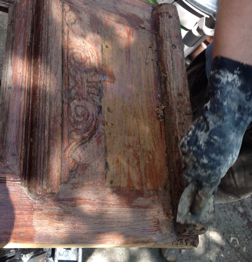
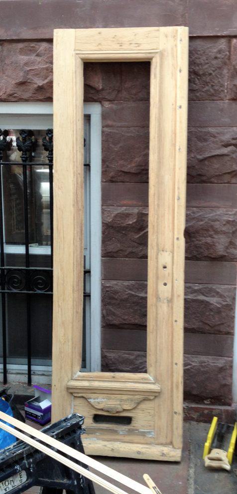
Choosing paint colors was never hard – “was” being the operative word here. Ever since we became the owners care-takers of the Pink Lady, I have been struck with what I call Paint Paralysis. Maybe it’s because we’re spending so much time removing all vestiges of questionable paint choices of the past (all manner of pink, blue and, of course, Muppet Flesh). I’ve been mulling over paint colors for almost 3 years, and I haven’t really decided. First I thought I’d jump head first into the gray wagon, but on second thought, that seemed too trendy (although I have used it in the house)

As part of the Style Cure, I must pick a wall color. Needless to say, I’m way behind schedule: I simply can’t decide. My gut keeps veering over to aqua, or what I’d like to call Hospital Green. We  used the color in our previous kitchen and I just love it so much. It’s kitsch, it’s wonderful. But do I want it in my dining room? I don’t know.

To help me decide, I looked up Late Victorian Period paint colors. It didn’t help. While the Victorians were into color, they were not necessarily into colors I would put on my walls – and that makes me feel terrible, because our restoration of the Pink Lady aims to honor the historical character of the house.

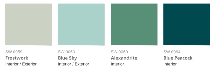
Upon further poking around, I found a color palate from the Jazz Age, and that one I like quite a bit (perhaps because of this):

Benjamin Moore also has a historical paints palate, but they neglect to properly qualify what period goes with what color.

Retro Renovation has a super useful list of 20th historical pants by  manufacturer and The National Trust for Historic Preservation has a collection of Valspar paint colors that cover Georgian, Neoclassical, Southwestern and Victorian colors.

The more I research, the more I realize that I don’t see eye to eye with my beloved Victorians when it comes to wall color. I’m going to have to jump ahead a few decades to the Jazz Age. And since the Pink Lady certainly lived through the roaring 20s, that’s historical enough for me. Bring on the aqua Blue Sky SW00 63!


Black Doors

Things have been a bit sluggish over the past few months, but a few projects did get crossed off the list. First up: front doors.

The doors are not original, but they are close enough. The previous owner installed these and overall, we’re really happy with them. They are a close match to what the original doors looked like. The problem was the finish – or lack thereof. Our house has southern exposure and it gets quite a bit of morning sun, which was unkind to the varnish.

Here is a before/during shot (of course I forgot to that a proper before photo). Both sides used to look like the one of the left.

Door (before)

Removing the finish (with ZipStrip)

removing the finish

Once free of the varnish (and whatever else coated the door), we gave it a light sanding and filled in some holes with putty.

sanded and puttied

The wood was quite damaged in some spots, and we decided it would be better to paint rather than stain it.  We decided on black with just a tad of shine (which is a fun thing to go buy at the Benjamin Moore paint store).

– You just want black?

– Yes.

– We have this new onyx color that has a little bit of gray…

– No thanks. Just black.

Anyway, here is what it looked like with one coat of paint:

painted

And this is what the doors look in place. Of course, we forgot to paint the outside of the trim holding the glass. We also learned that entry door hardware is absurdly expensive (particularly the period appropriate kind I want), so the full makeover of the door will have to wait a little longer. Considering I’ve been slacking on the façade job, pretty sure no one will notice the unpainted trim…

(almost) done

Progress in the Garden Hallway

The Pink Lady  has been throwing us some curve balls lately. No, not the doorbell that rings randomly (it seems as we have a ghost that locked itself out and wants back in. I call her Constance). Our biggest problem is that the mechanical systems are organizing a mutiny and a general strike of Greek proportions. Oy!

So let’s talk about something different entirely, shall we? Here is some good before/after stuff that is far more fun that plumbing, BTUs and wiring:

Remember what the floor looked like when we bought the house?

This shot extra dark and gloomy to illustrate exactly how we felt about this part of the house

Looking towards the front of the house (the door leads to the entrance under the stoop)

Well, through the creative use of a crow bar, some elbow grease and the magic of turning round bamboo into flat flooring, we now have this:

Work in progress: the floor is in, just missing the trim pieces

There is still some work left to be done in this area, but one more weekend and it should be done. Woo hoo!

Alas! The Interwebs!

It took 2 separate trips by Cablevision and four sets of technicians, but we are fully connected to the world outside now. Woo hoo!

During our 27 days of cable/internet hiatus, we did things the pioneering way: went to bed early, read books for entertainment, attempted to watch TV on our cellphones – OK, that right there? Neither old fashioned or effective. In any case, some actual work on the house also got done.

After much hemming and hawing about paint color, we decided on a combination of dark/light gray and pure white for the garden level hallway and staircase. The wainscoting and the spindles will be light gray, the banister and the steps charcoal gray. The doors and door moldings semi gloss white and the walls flat white, like so:

The new floor will be going in this weekend and I will post full before and after pics – from muppet flesh tone orange, to monotone awesomeness.

This is actually really out of character for me, since I’m a fan of color. I have no idea where this love of muted monochrome tones came from. For the third floor, I’ve been debating the finer points of way too many shades of white, something that I will get to as soon as we deal with the cracks in the plaster: